after i had finished these to a standard i liked i decided to start building the level itself. i tried my best to stick to the plan's i had created but occasionally i had to adjust to the way i had it in the engine as i couldn't figure out how to fix certain things with the level.
this is an image taken from my level and it shows the exterior of the warehouse. i tried to make the surrounding look overgrown and abandoned. i tried my best to make it also look run down but i found it very difficult to make it look that way.
here we have the first corridor you enter. when in here there are 2 directions but one is blocked by a collapse of rubble and rocks so your sort of made to go this way. i tried to make it seem spooky however i couldnt get the sound input to work so i was forced to give up on the idea
this is an image of the next room after the corridor. i had plans to add a cutscene here which would lead into the next part of the level however i didnt know how to make a working cutscene and i also had no idea how to make the transision into a different area all together so i made the next section in a different document.
finally for this section of the level i tried to add some spooky elements like fog and spooky sound but i could only get the fog to work.
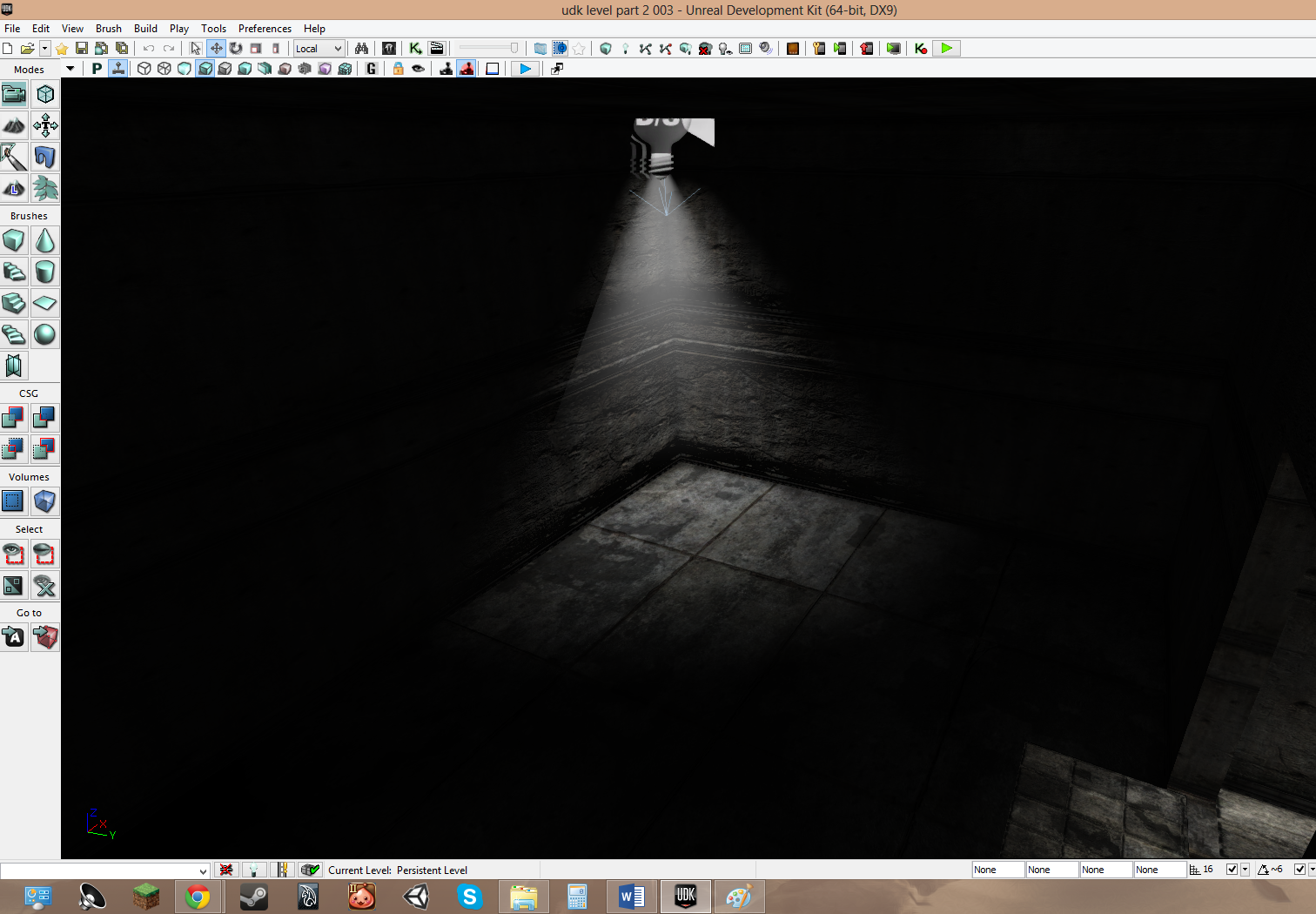
after the cutscene you would wake up from being unconcious here. this is the portion of the level where i wanted to explore the dark element. so i put a single light in the centre of the room and from there you would move through the rooms
this is the second of the few rooms and it is mostly dark. if i could i would have added music and sounds to add to the feel of the level
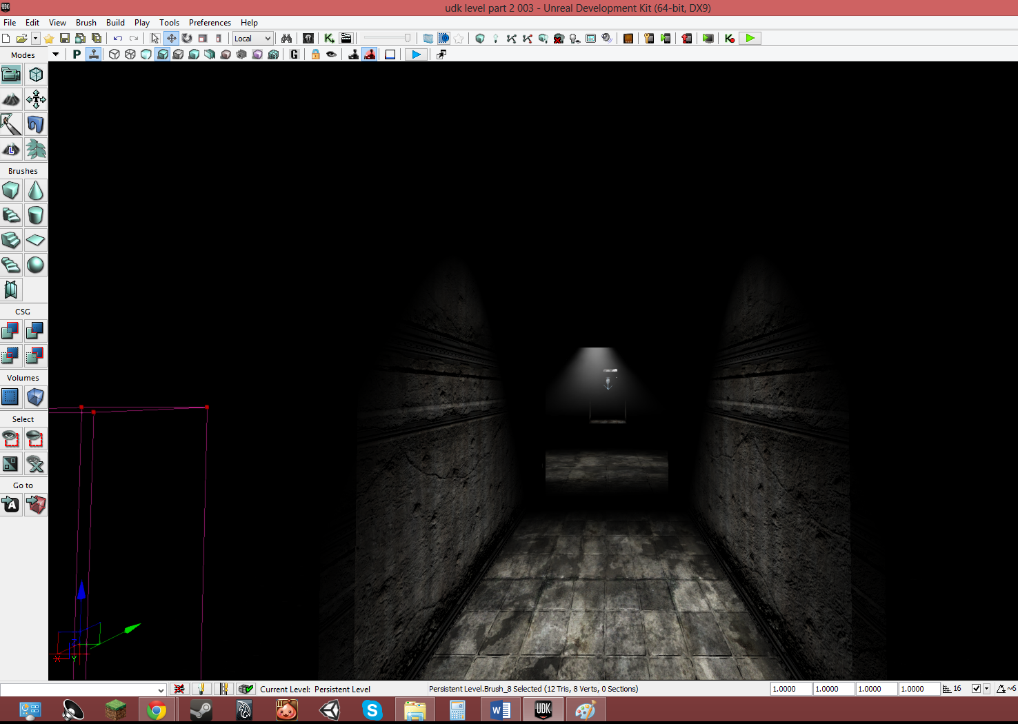
this is the final section which is a rather long corridor with simple lights just to show which way to go forward in the level
- the level design i feel went well as the level looked mostly how the plans looks and i liked the plans a lot
- the effect's that i managed to add like the darkness with singular spotlights and fog.
- the feel the 2 sections of the level gave me was that of a horror game so in my opinion it was a success.
What Went Wrong
- while making the levels i couldn't add everything i wanted like cut scene's, music and simple sounds that would have added to the effect and feel of the level
- i had a lot of trouble with some sections of the the level in terms of texture's and meshes
- the length of the level altogether wasn't as long and indepth as i was hoping it would be.
What I Would do next time
- i would work a lot more on the aspect mentioned earlier
- spend less time on small section's of the level as now i am better with UDK
- i would request more help with my project and that would mean i would get everything i wanted out of my idea


