Wednesday, 12 February 2014

Evaluation of Animation project

For this project we were required to design and construct a 2d and a 3d animation. in terms of the 3d animation i accomplished this task well creating exactly the animation i wanted for it. however for the 2D animation i had allot of trouble as im not the best at art and 2d has a very strong aspect of drawing so i didn't develop a good enough animation to meet the task.

For my 3d animation i developed an animation around two sibling who are fighting as one has stolen the 'item' which for this i have chosen an Xbox as the item. i chose this as it has been a common occurrence in my home for argument to sprout from a console being moved or games borrowed without permission so i thought of it as a good idea to make an animation around experiences of my own.

After presenting my animation some of the feedback was good and some bad as with most kinds of feedback. some said that the movement in terms of arms was fluent and smooth. furthermore the lip sync was 'spot on' and the scenery made it appear like a realistic environment.

In terms of movement i think that i could have made more use of the space that the rig had so i could have had him walk to the object in question and point directly at it and also i could have had the other staying as far away from the other as to simulate scared actions. in addition to this i think that the lip syncing could have been a bit more dramatic like the mouth gets wider when the sound levels increase. finally in terms of scenery i had developed some assets to represent scenery but i used the wrong camera angles to portray it. mostly skipping the assets made completely. making it hard to imagine what the two siblings are fighting over.

if i was to redo this i would defiantly make it more dramatic and over the top and i would add a huge variety of camera shot to help elaborate on the scenery and what was essentially going on as it wasn't quite as clear as i had initially hoped.


for the 2d animation i didn't get past the planning stage as it took far too long for me to get going really on the Photoshop side of things as my skill isn't very good in terms of art so i know now that definitely i will need to manage my time in the future on different projects with care just to make sure that i have the time i need to complete the task given to me.

Research (animation project)

2D animation is a shorter way of saying two-dimensional animation and it has been around since the early 20th century. two dimensions means that the animation is completely flat and was originally mostly drawn by hand. some of the techniques of 2d animation are Flick book, Rotoscope, drawn on film, flash animation and photographic animation. the main difference between 2D and 3D animation is that in 3D animation you can see the object from all sides. so for instance for a 2d object you would have to draw it at a different angle whereas in 3d all you would have to do is rotate the object.

from all the different examples of 2d and 3d animation i think that both are effective in there means and i can see how one would be easier than the other for certain people. like if a person is good at art then they will most lprobably do better in this field as it is mainly focus arround something that they are good at. furthermore it would work the other way arround if a person is better at computer techniques and with the technology anyway they would do better in the 3d field.

Flip Book

a flipbook is an effective way of creating a 2d animation and is also a very old method used for a long time now. flipbooks consist of a series of images that combine together to create the illusion that someone or something is moving. this can be a challenging method if the person trying to create the animation isnt particularly good at art as it requires good technique and accuratly drawing similar images over and over again with only slight changes. however what is needed for this is simply a notebook or pad and a pencil, so it is definatly one of the cheapest method of creating a decent animation.
Flipbook first appeared in 1868 and was painted by John Linnet.
File:Linnet kineograph 1886.jpg
Advantages:
Cheap
dont need to be good with computer.

Disadvantages
is a slow process taking weeks and weeks
easy to mess up if u make the most slight mistake
essential to be good at art

Cell Animation

cell animation is a rather old method of animation, however like all, if used in the correct way can still be effective. this kind of aniamtion was used in the development and creation of some of the first animated movies like 'snow white' in 1937 and 'sleeping beauty' in 1959. it is called a cell animation because the cells are like layers which we would use in newer technological advancements in software like photoshop and adobe flash. however like most 2d animation started in hand because the software was far thought of when cell first started to be used as a method. So each individial drawing was place ontop of another and moved in a certain way to try to simulate where they wanted the animated person to move.

Advantages of cell:

unreal finish effect

new skills

disadvantages

stressful (as it can be incosistant)

takes a long time

Rotoscopingpicture master

this is another form of animation whaere the animators trace over footage. this can be for live action and animated films. the animators use projectors to put the image onto frosted glass panels to redraw the footage. this method was invented by Max Fleischer and used it in his animated series out of the inkwell. he used this method in a number of his future works.

Advantages:

realistic

time will be accurate

Disadvantages:

time consuming

expensive (specialist tools)

Drawn on film

this is one of the least well known techniques. this is essentially making a film or video without the use of a camera. the animator draws directly onto the film stock and the results can vary depending on the skill of the creator as with any animation process. the process isnt very well known as the animation itself doesnt have anything a typical animation will have like people, animals, scenery or objects. just shapes which flow in an uncoventional way to make an effective and magnificent piece of work. here is a link to a particular piece of work which i think is well done and enjoyable to watch.

https://www.youtube.com/watch?v=HjDAepjjop4

Unit 3: Ideas and Concepts in Art and Design

In the many different industries out there they all have many differences but at the beginning they all have one similarity and that is that they all start with the concept art. the artists have to come up with the perfect shape, size to fit the task they have to do. this is so later on these design's can be used in the future for there purpose whether it be advertising for the product like cars or if there used in the games industry then the 3d artist will need accurate sketches so that they can design it correctly.


these images show off concept art for vehicles, when the artists were designing these they wanted to sell the product which in this situation would be cars. the cars have to influence buyers to buy the product so they make it look at good as possible. however i think that when they were designing these they were also trying to make it look a bit sci-fi too which might influence the decisions of buyers. this appears to be an effective form of design. furthermore they share some characteristics like the smoothness across the body of the car. these look like they were drawn using a computer like Photoshop. however they could be pencil drawn. i cant entirely tell. the below images are examples of sci-fi ideas generated for either entertainment of games purposes.


unit: 3D modeling (P1)

3D modelling is used in all sorts of different industries and in these individual industries for many different purposes. Some of these industries are: Entertainment, Games, architecture, advertising and science.

Entertainment

the entertainment industry is one of the most obvious of these is. this is because it has become a massive part of the industry with not many films coming out that doesn't have extensive involvement with 3D modelling. i would say it is mostly used in special effects for making lots of different aspects. however, it isn't uncommon to have shots where things are added into a frame or frames. 3D graphic artists using computer graphics imaging (CGI) can furthermore take things out of a shot which they don't want to be there.

Gaming

another industry which extensively uses 3D modelling. it is used for all sorts of things whether it be creating different aspects like vehicles, space ships, creature's, aliens etc. As time progresses the looks of this industry look more and more lifelike and real. This industry is growing rapidly as games become more and more popular.

Architecture

not as widely used in this industry. often it is used to show the project and map out the wanted end point. often it is used to show clients what there paying for. this would also help encourage them to buy as they can see what there paying for prior to any costs.

advertising

3D artists can help advertisers depict the productin the ideal state. it allows companies to render all sorts of things like: new car's, new product packaging and prototype's. if it doesnt work they can fix it by easily changing the mesh. once perfected the advertisers can use that to sell the item before they have to invest capital in production.

science

scientists can use modeling to create models that simulate lots of things like: earthquakes, landforms, ocean trenches etc. additionally it can simulate motion like flight patterns and also include all the factors that affect them.

Tuesday, 7 January 2014

logbook (horror)

When i began this project i had a few issue's as i have very little experience with UDK and so i began by just planning and as you can see from the concept art i have a selection of outdoor idea's and also some interior to match. when i was drawing some simple idea's i just started by trying to draw some dark and gloomy environments. At this point i had not thought about what kind of phobia's i liked and would use for the influence on my level design. When i began to choose from phobia's i choose a few i liked and put them together and drew a few different idea's for each phobia and i choose from there which phobia i liked best. Among the chosen there is fear of: dark, death, spiders, clowns and unknown. i decided to choose dark and unknown as i liked those better than the other one's. From here i drew simple layout's for the level with idea's of what each room or corridor would look like.

after i had finished these to a standard i liked i decided to start building the level itself. i tried my best to stick to the plan's i had created but occasionally i had to adjust to the way i had it in the engine as i couldn't figure out how to fix certain things with the level.

this is an image taken from my level and it shows the exterior of the warehouse. i tried to make the surrounding look overgrown and abandoned. i tried my best to make it also look run down but i found it very difficult to make it look that way.


here we have the first corridor you enter. when in here there are 2 directions but one is blocked by a collapse of rubble and rocks so your sort of made to go this way. i tried to make it seem spooky however i couldnt get the sound input to work so i was forced to give up on the idea


this is an image of the next room after the corridor. i had plans to add a cutscene here which would lead into the next part of the level however i didnt know how to make a working cutscene and i also had no idea how to make the transision into a different area all together so i made the next section in a different document. 


finally for this section of the level i tried to add some spooky elements like fog and spooky sound but i could only get the fog to work.

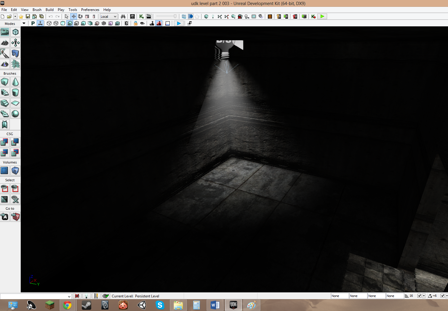
after the cutscene you would wake up from being unconcious here. this is the portion of the level where i wanted to explore the dark element. so i put a single light in the centre of the room and from there you would move through the rooms


this is the second of the few rooms and it is mostly dark. if i could i would have added music and sounds to add to the feel of the level


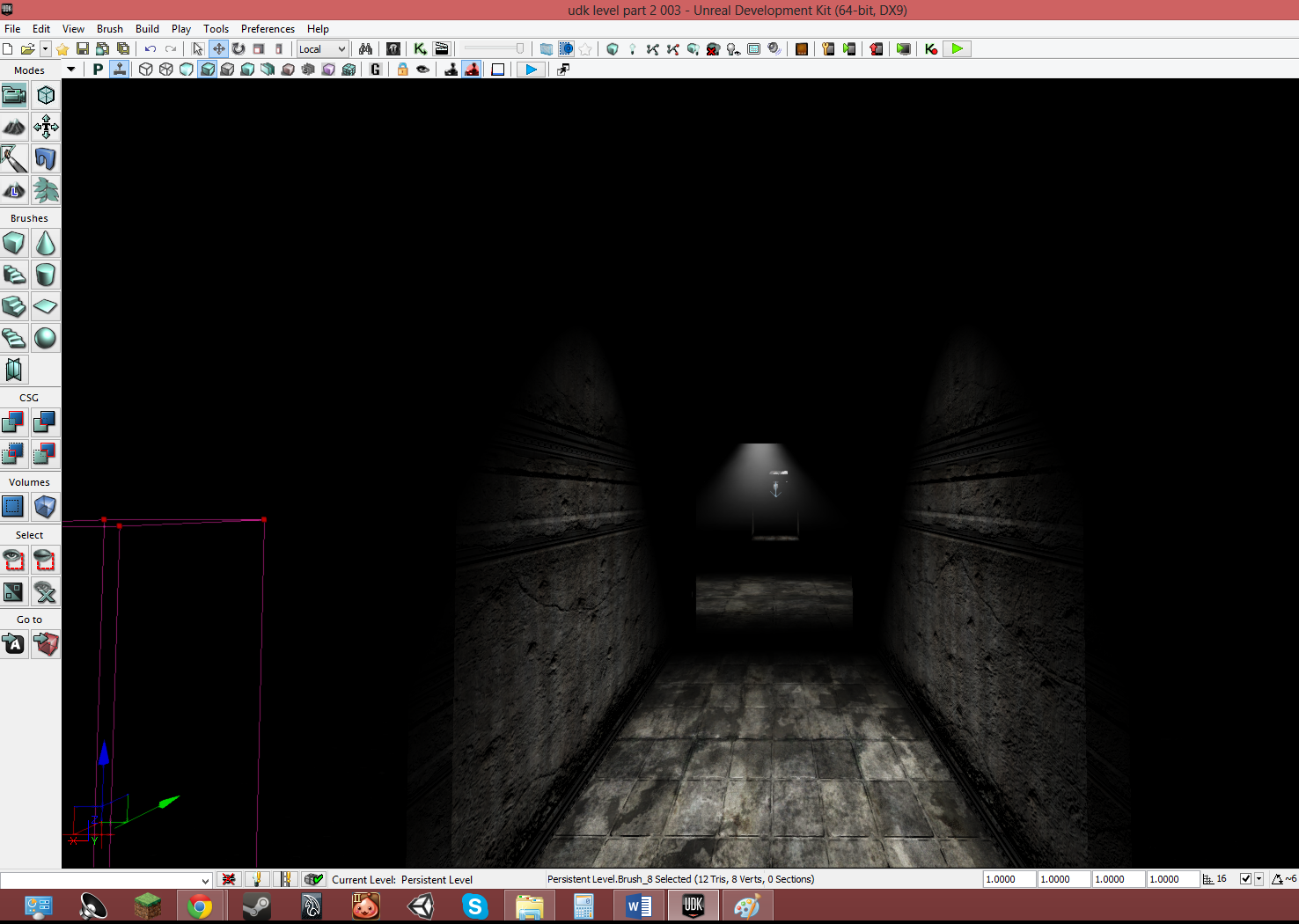
this is the final section which is a rather long corridor with simple lights just to show which way to go forward in the level

 What Went Well:

  • the level design i feel went well as the level looked mostly how the plans looks and i liked the plans a lot
  • the effect's that i managed to add like the darkness with singular spotlights and fog.
  • the feel the 2 sections of the level gave me was that of a horror game so in my opinion it was a success.
What Went Wrong
  • while making the levels i couldn't add everything i wanted like cut scene's, music and simple sounds that would have added to the effect and feel of the level
  • i had a lot of trouble with some sections of the the level in terms of texture's and meshes
  • the length of the level altogether wasn't as long and indepth as i was hoping it would be.
What I Would do next time
  • i would work a lot more on the aspect mentioned earlier 
  • spend less time on small section's of the level as now i am better with UDK
  • i would request more help with my project and that would mean i would get everything i wanted out of my idea


Monday, 6 January 2014

Mood Board (horror enviroment)


These are just a few image's depicting the huge genre that is horror. There are many different point's that i could explore the genre and i particularly like the haunted house idea and may base my environment on this idea. however i will also have to consider the many other possibilities.

Monday, 4 November 2013

Geometric theory in 3D Modeling

Geometric theory in 3D Modeling
In games development the process of geometric theory is a way to model objects or characters 3D modelling software. The way this is performed is through a design process using an initial mesh which gives the basic shape of an object to later be built upon with different textures. The way in which a mesh is created is through the process of combined polygons. In the creation of a polygon two vertices are connected together by a line creating a first edge. When another vertices is added and two more line edges are connected it, this creates a basic triangle polygon with a face; which is the simplest version of a polygon that can be made. Before this basic shape is created, extra vertices can be added after a third to create a shape called a quad which is composed of four edges. This can be carried on with more vertices to create more complex shapes such as hexagons and decagons. An example of a three vertices triangle polygon with a pin point to each feature is displayed below.


When using polygons to create a mesh for a game, correct shapes must be determined both for correct design and for fluid movement should the shape be used for a moving character. In order to do this, different shaped polygons can be combined to create a new shape. For example the triangle polygon is widely used in combination with others to create more squared or kited shapes and can be used for more fluid movement. As a mesh is created polygons are steadily joined together by each vertices until a shape is complete with no vertices detached from any other. This rule applies to both characters and objects within a game as not doing this would leave a split in the created item, leading it to not be whole. Once the 2D polygons have all been joined together into their desired shape with no vertices left detached, the shape that is created becomes a 3D model composed entirely of 2D polygons.